Category Archives: ICT in Science Class

IB Biology StatBook 2026
Almost 15 years ago, on i-Biology, I released the first version of the IB Biology StatBook: an interactive Excel workbook to support teaching the (now defunct) Statistical Analysis unit and for data processing & presentation*. Now, with the help of Claude Design, I’ve updated and turned it into a live web-app.

The new microsite is on https://ifyouuseme.ai/i-biology/statbook under “Stats & Data” and includes:
The new microsite is on https://ifyouuseme.ai/i-biology under “Stats & Data” and includes:
- Decision-trees for choosing statistical tools.
- Interactive examples of everything IB Biologists need to do.
- Worked explanations of the various methods, including t-tests (paired and unpaired), Chi-squared tests, Mann-Whitney U tests.
- Guidance on data processing and presentation.
- Statistics glossary.
- Comparing means with bars, X-markers, error bars and population distributions.
- R² best-fit and dot-to-dot plotting.
- Curve detection and explanation of different types of curves.
- Outlier detection.
- Fixing appropriate decimal places.


Students could put their own data into this tool to see how the different approaches might work, but it won’t give them the final product. They will still need to understand and present their work appropriately. Teachers can use this to demonstrate the different forms of tests and analysis live in class.
If you use these resources, you are not using any AI: it is all handled locally in your browser.

These resources are hosted on the support site for (If You) USEME-AI: Learning for Hope & Agency in an AI World.
*it’s still live, you can get it (and the slides) here.
Data Literacy with ‘Explore’ in GoogleSheets
Super-quick lesson idea for teaching datasets and presentation types. When processing data in Google Sheets, use the ‘Explore’ feature, highlighting parts of the dataset. Click here for an example (to save a copy, go to ‘file –> make a copy’).
For: Sciences, Maths
Thanks to Liz Durkin (@lizdk) for the reminder of this feature.
Questions to ask students
- What are different types of data (continuous, discontinuous)
- Why do we use graphical presentations of data?
- What information do we need to be able to present data clearly?
- Why are some data presentations suitable for some sets of data and not others?
- How are the ‘basic’ presentations of data limited? (or Why can’t I use a bar chart for everything?).
- How does my interpretation of the data change when I change the graph or chart type?
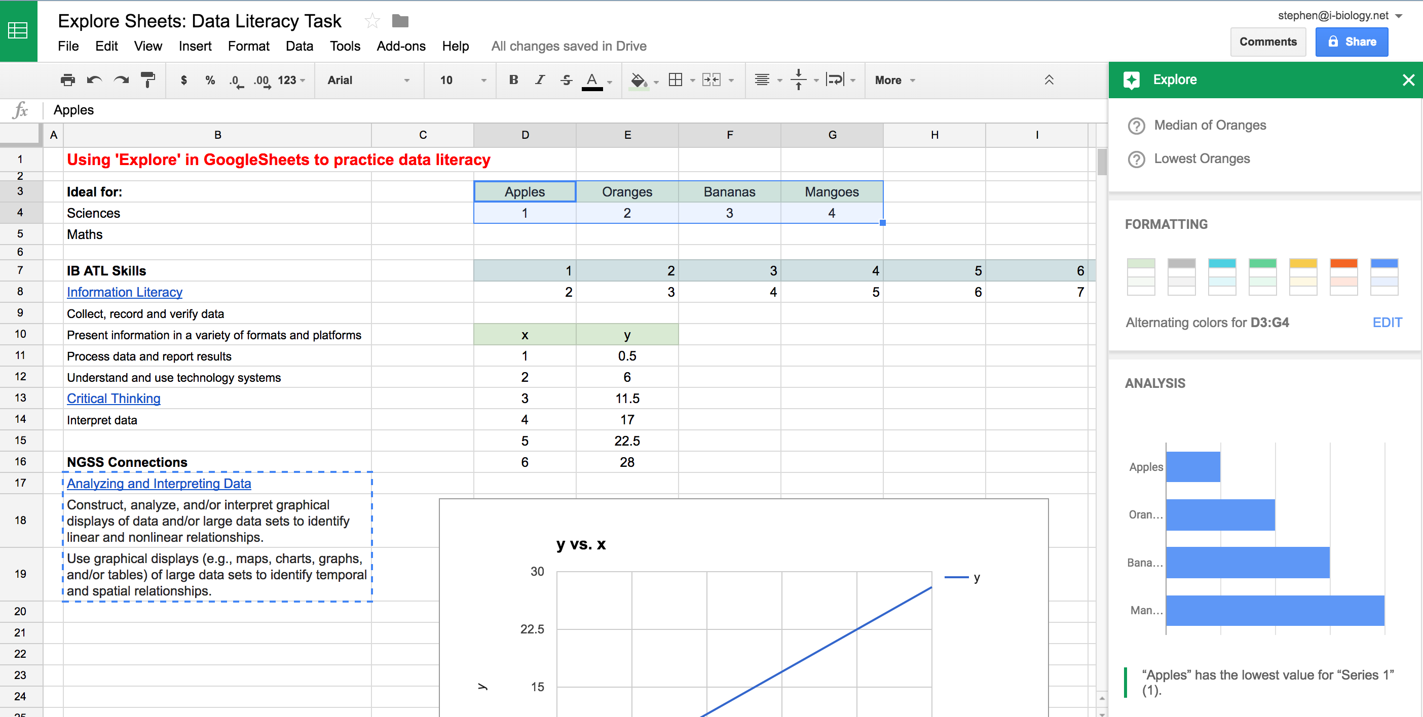 Explore in GoogleSheets – a quick way to visualize some of the data collected in an experiment or survey, and an opportunity to teach some data literacy and critical thinking skills. Click to open.
Going Further: Here is a set of resources for more advanced data presentation and statistics, used for IBBio, but useful for more: IBBio Statbook by Stephen Taylor. This one is for MYP Chemistry.
………o0O0o……….
MYP ATL Skills
| Information Literacy |
| Collect, record and verify data |
| Present information in a variety of formats and platforms |
| Process data and report results |
| Understand and use technology systems |
| Critical Thinking |
| Interpret data |
NGSS Connections
| Analyzing and Interpreting Data |
| Construct, analyze, and/or interpret graphical displays of data and/or large data sets to identify linear and nonlinear relationships. |
| Use graphical displays (e.g., maps, charts, graphs, and/or tables) of large data sets to identify temporal and spatial relationships. |
Review Vocab Quizzes with Quizlet
In this task we ‘crowd-sourced’ definitions and descriptions for a lot of the (lot of) vocabulary we have learned this year. This is to reinforce that Biology is as much a language course as a science course, and that everything is connected.
- Create a google spreadsheet with tabs numbered by subtopics covered
- Assign groups of topics to groups of students, with the simple task:
- First column, keyword, correctly spelled
- Second column: definition (exactly from subject guide if it exists) or clear description
- After groups finish, peer-edit
- Does it make sense? Are there any errors?
- It the definition clear in the ‘wider sense’ of the course?
- Adapt definitions with clarifications, or starters such as ‘process’, ‘structure’, ‘hormone’ etc
In our spreadsheet, we identified 312 terms (and growing) from this year.
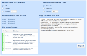
Click to start a Quizlet set
In between sessions:
- Check and edit as much as needed/possible
- Import vocab into quizlet to create the set
- Very easy: select columns and paste into the right-hand field
- Make sure ‘tab’ is set, top-left
- Hit ‘import’ if it looks right
- Create quizzes/activities
- Share quizlet codes and spreadsheet URL with students
- Get reviewing!
During classes:
- Students can review using the Quizlet activities
- Students might use the vocab list to make sure they are meeting markscheme requirements for target language – are they giving complete and correct answers?
- Students can use the vocab as a foundation for concept-maps, model responses etc.
Example (sadly Quizlet doesn’t embed to WordPress.com)
- MrT’s class, Year 1 vocab (student definitions)
……….o0O0o………
If you have any creative – and effective – review methods, let us know in the comments or on Twitter!
30-Minute Inquiry: Base-substitution mutations
This has worked well (and been fun) as a topic review, way to make use of databases (ICT in IBBio requirement) and make connections as we.
Question: What do HBB, PAH, PKD1, NF1, CFTR, Opn1Mw and HEXA have in common?
Concepts: Structure vs Function; Universality & Diversity.
The set-up:
- Assign groups by handing out cards with the codes above (we had already studied HBB, so didn’t include it) and asking them to find each other.
- Give them the instructions – to produce a simple poster & 1-minute overview of their disorder, using the guidance in the image below.
- Go. Lots of discussion, lots of questioning. If students get stuck, they need to look it up, evaluate their sources and keep on going.
- Students will need to use the NCBI gene database to get going: http://www.ncbi.nlm.nih.gov/gene
Check they’re on the right track: HBB (sickle cell), PAH (PKU), PKD1 (polycystic kidney disease), NF1 (neurofibromatosis), CFTR (cystic fibrosis), Opn1Mw (medium-wave sensitive colour-blindness), HEXA (Tay-Sachs disease). They are all disorders causes by base-substitution mutations.
After 30 minutes:
- Groups present to the class what they have found.
- As the class sharing continues, ask questions based on connections:
- What similarities and differences do we see?
- What are the normal functions of these genes and how does this connect to our understanding of proteins, channels, pumps, etc.

GoogleTrends: Exploring Patterns in Search Data [DBQs & Inquiry]
GoogleTrends allows you to plot the popularity of search terms (since 2004), by geographical region or worldwide. This could be a great way to launch inquiry on a topic in science that has seasonal trends or patterns, and could be used to set up simple DBQ practice. It is limited in the linear presentation of data, and the data are search frequencies rather than scientific data, but as the patterns raise questions, they could be followed-up with searches for more valid sources and explanations.
In the example below, Frank Swain (@SciencePunk) had put in the search term “morning after pill” for the UK and found a peak every Sunday. An interesting pattern that could set up some discussion in class based on reproduction, behaviour, risk management, ethics, hormonal control or more.

“Morning After Pill” search term on GoogleTrends http://www.google.com/trends/
This could lead to a quick (though basic) way to set up some simple data-based questions or stimulus for exploration. Here is a plot for the search term “vaccine”. Think of the questions it might raise in discussion.

GoogleTrend Worldwide since 2004: “Vaccine” What DBQ’s could you ask?
What questions does it raise and how would it lead to further exploration? Here are some examples:
- Why does it peak each October?
- Why was traffic so high in 2009-10?
- What do you predict for the coming year?
This leads into discussion of sources of information, accessing databases and the reasons for vaccines.
One neat feature is that you can add other search terms to the graph in the same time period, though it will normalise the data. Another is the ‘headlines’ feature that shows some popular news headlines near peaks. Yet another is the ‘predict’ feature that will model the coming year based on trends and patterns. “Predict” is often asked in DBQ’s, so this might make for some good questions. Here’s what happens when we add “flu vaccine”, headlines and the forecast:

GoogleTrends: “Vaccine” and “Flu vaccine”, worldwide, 2004-present.
From this exploration, you could move onto looking at flu trends, and GoogleTrends has special sections for tracking flu and dengue fever:
……….o0O0o……….
This next one is a neat demonstration of what happens when you change the scale of the y-axis. In this case, the second dataset is added, compared to the original and the original becomes much less noticeable as a result. How many times do we tell our students to set appropriate scales on the axes and make use of the space to be able to see trends and patterns?
For another bit of fun, here’s one on “Genome”:
……….o0O0o………..
Summary:
- A quick, easy launching pad for inquiry
- Develop simple DBQs easily
- Does need to be supported by inquiry into more valid sources for the topic
- Each graph is ‘normalised’ which could lead into useful discussion of the effect of scales on data presentation
Excel Graphing Screencasts
These two videos are for my classes, made using the free screencast tool ScreenCast-O-Matic.
The first is for my IB Bio group for setting up a graph for a complex set of data, adding extra datasets, error bars and formatting. The second is a similar video for a simple Physics investigation in Grade 10.
Hopefully they are helpful as you can go back and re-watch important bits as you do the write-ups.
If anyone knows of a decent way to add best-fit curves (lines are easy) to datasets, please let me know!
Inside Nature’s Giants
Channel 4’s fantastic series has just ended in the UK (I’m back for a holiday), and I can’t wait for the DVD. This is the kind of natural history quality that the BBC normally has a monopoly on, but C4 have presented something outstanding here.

Fin Whale Dissection
Over the four episodes, Mark Evans presents dissections of four giants of the animal world: elephant, whale, crocodile and giraffe. On hand is the expert anatomist Joy Reidenberg, who does a great job of taking apart and explaining their findings. Richard Dawkins takes the opportunity to point out some of the wonders of evolution in the animals, using anatomical and computer-graphic explanations. It’s great.
Embedded below are part one and part two of the second episode: fin whale. Rather than dissect at the Royal Veterinary College as normal, their challenge was to dissect this whale which washed up on the coast of Ireland before it exploded with decomposition.
If you can get 4onDemand, all four episodes are available online for a month. They are not available for download, but to really get the full effect, you need a high-quality image – so fingers crossed for the DVD!
For now, visit the official website for some clips and animal autopsy games.
Pandemic II: Educational Flash Game

Pandemic II: Spread the World
Thanks to the excellent NotExactlyRocketScience blog for posting the link to this game. Pandemic II is a complex flash game based on strategy, evolution (though more like design) and the spread of disease. The premise is simple – take a pathogen (bacteria, virus or parasite), and watch its spread across the globe. Along the way you can alter the pathogen to change its properties, making it more infectious, more lethal or less noticeable. The aim of the game is to wipe out the population of the world.
It is easy to save using Firefox add-ons.
Check out the game here: http://www.crazymonkeygames.com/Pandemic-2.html
And the tutorials here:
Is it better than the addictive Magic Pen Game or Foldit?
Have a go!
MOLO: The Molecular Logic Project
![]() The Molecular Logic Project aims “to improve the ability of all students to understand fundamental biological phenomena in terms of the interactions of atoms and molecules”. They achieve this with an extensive database of online java-based simluations and models for students to use. The animations are simple, and there are a lot of activities to choose from. To make it work, you’ll need to install their software.
The Molecular Logic Project aims “to improve the ability of all students to understand fundamental biological phenomena in terms of the interactions of atoms and molecules”. They achieve this with an extensive database of online java-based simluations and models for students to use. The animations are simple, and there are a lot of activities to choose from. To make it work, you’ll need to install their software.
–
Some highlights for IB Bio:
How do mutations affect protein folding?

How does gene mutation affect protein folding?
And loads more here: Biology, Molecular Biology (Chem of life), Physics/Chemistry.