Category Archives: Approaches to Learning
Pomodoro Organizer: Get Stuff Done
The Pomodoro Technique is an effective way to overcome procrastination, get started on big tasks (by breaking them into smaller tasks) and to use time effectively. Essentially, by “hacking” your brain’s reward pathway with manageable chunks of time and small reward breaks, it can help overcome the fear of getting going.
 This graphic organizer (pdf) is to help set a plan for a working period, recognizing that:
- Setting clear and realistic goal is essential
- Breaking large tasks into smaller steps helps get things done
- Rewards/short breaks keep the brain motivated
- Setting an overall end time is also really important
- A distraction-free environment will really help
Of course if, once you get going, you find “flow” and can’t stop working… then get it done!
For more ATL-related graphic organisers, click here.
Tech Tools:
- The Chrome extension Pomodoro Timer Pro allows you to set times and “blacklist” sites that might be distractions.
- Online Stopwatch has a good full-screen tomato timer. Scan the QR code below to start the timer running.
“Levels of Why?” Graphic Organizer
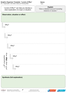
Levels of Why – click to download a pdf
This is a graphic organiser developed to help students move from outline or describe into explain.
- Begin with stating the situation, change or process.
- What is the surface explanation or reason?
- Why does that occur?
- What about that?
And so on…
Data Literacy with ‘Explore’ in GoogleSheets
Super-quick lesson idea for teaching datasets and presentation types. When processing data in Google Sheets, use the ‘Explore’ feature, highlighting parts of the dataset. Click here for an example (to save a copy, go to ‘file –> make a copy’).
For: Sciences, Maths
Thanks to Liz Durkin (@lizdk) for the reminder of this feature.
Questions to ask students
- What are different types of data (continuous, discontinuous)
- Why do we use graphical presentations of data?
- What information do we need to be able to present data clearly?
- Why are some data presentations suitable for some sets of data and not others?
- How are the ‘basic’ presentations of data limited? (or Why can’t I use a bar chart for everything?).
- How does my interpretation of the data change when I change the graph or chart type?
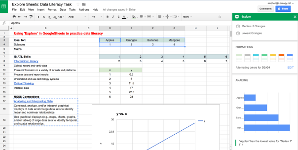 Explore in GoogleSheets – a quick way to visualize some of the data collected in an experiment or survey, and an opportunity to teach some data literacy and critical thinking skills. Click to open.
Going Further: Here is a set of resources for more advanced data presentation and statistics, used for IBBio, but useful for more: IBBio Statbook by Stephen Taylor. This one is for MYP Chemistry.
………o0O0o……….
MYP ATL Skills
| Information Literacy |
| Collect, record and verify data |
| Present information in a variety of formats and platforms |
| Process data and report results |
| Understand and use technology systems |
| Critical Thinking |
| Interpret data |
NGSS Connections
| Analyzing and Interpreting Data |
| Construct, analyze, and/or interpret graphical displays of data and/or large data sets to identify linear and nonlinear relationships. |
| Use graphical displays (e.g., maps, charts, graphs, and/or tables) of large data sets to identify temporal and spatial relationships. |
GoogleEarth Engine Timelapse: Quick Lesson Plan
Here’s a quick lesson plan idea for tuning into inquiry using Google Earth Engine Timelapse*. It can provide a timelapse of change from 1984-present, based on satellite and aerial photos.
Context
Ideal for: Individuals & Societies, Sciences, Interdisciplinary Unit
Global Context(s): Fairness & Development or Globalization & Sustainability
Key Concept(s): Change, Development, Interactions, Time-Place-Space
Related Concepts (I&S): Globalization, growth, resources, sustainability, causality
Related Concepts (Sciences): Environment, transformation, consequence, evidence
Tuning In
Find where we live and model See-Think-Wonder (Project Zero) on the timelapse from 1984-now. You might want to create a GoogleSheet with columns for each stage, to be shared with the class. Alternatively, get out some big whiteboards or butcher paper.
- See: look for general outlines, specific landmarks, big developments, interesting changes. Then dig deeper – compare the start to the end, or look for evidence of significant events in the time period. Keep pushing the ‘see’ until ideas are truly exhausted.
- Think: connected to the ‘see’ statements, note potential cause-effect relationships, sequences, consequences or other ideas. Keep going until this is exhausted.
- Wonder: finally build on the ‘see’ and ‘think’. What questions does this generate? Categorize and rank the questions.
Finding Out
- What lines of inquiry will you take to find out more?
- What can be found out by students and what needs to be explicitly taught?
- What unit-related vocabulary needs to be used and taught?
Approaches to Learning
- Access information to be informed and inform others
- Make connections between various sources of information
- Understand and use technology systems
- Practise observing carefully in order to recognize problems
- Interpret data
- Draw reasonable conclusions and generalizations
- Revise understanding based on new information and evidence
- Formulate factual, topical, conceptual and debatable questions
- Use models and simulations to explore complex systems and issues
- Identify trends and forecast possibilities
……….o0O0o……….
*HT Twitter:
Command Terms and Drawing Skills
My class need to review the definitions and the way we approach some of these command terms, so here is the Command Terms presentation as a reminder. November sessioners – your exam is in one week! Maybe these resources will help.
Get practicing with those calculators, too.