Category Archives: Spreadsheets and Graphing

IB Biology StatBook 2026
Almost 15 years ago, on i-Biology, I released the first version of the IB Biology StatBook: an interactive Excel workbook to support teaching the (now defunct) Statistical Analysis unit and for data processing & presentation*. Now, with the help of Claude Design, I’ve updated and turned it into a live web-app.

The new microsite is on https://ifyouuseme.ai/i-biology/statbook under “Stats & Data” and includes:
The new microsite is on https://ifyouuseme.ai/i-biology under “Stats & Data” and includes:
- Decision-trees for choosing statistical tools.
- Interactive examples of everything IB Biologists need to do.
- Worked explanations of the various methods, including t-tests (paired and unpaired), Chi-squared tests, Mann-Whitney U tests.
- Guidance on data processing and presentation.
- Statistics glossary.
- Comparing means with bars, X-markers, error bars and population distributions.
- R² best-fit and dot-to-dot plotting.
- Curve detection and explanation of different types of curves.
- Outlier detection.
- Fixing appropriate decimal places.


Students could put their own data into this tool to see how the different approaches might work, but it won’t give them the final product. They will still need to understand and present their work appropriately. Teachers can use this to demonstrate the different forms of tests and analysis live in class.
If you use these resources, you are not using any AI: it is all handled locally in your browser.

These resources are hosted on the support site for (If You) USEME-AI: Learning for Hope & Agency in an AI World.
*it’s still live, you can get it (and the slides) here.
Data Literacy with ‘Explore’ in GoogleSheets
Super-quick lesson idea for teaching datasets and presentation types. When processing data in Google Sheets, use the ‘Explore’ feature, highlighting parts of the dataset. Click here for an example (to save a copy, go to ‘file –> make a copy’).
For: Sciences, Maths
Thanks to Liz Durkin (@lizdk) for the reminder of this feature.
Questions to ask students
- What are different types of data (continuous, discontinuous)
- Why do we use graphical presentations of data?
- What information do we need to be able to present data clearly?
- Why are some data presentations suitable for some sets of data and not others?
- How are the ‘basic’ presentations of data limited? (or Why can’t I use a bar chart for everything?).
- How does my interpretation of the data change when I change the graph or chart type?
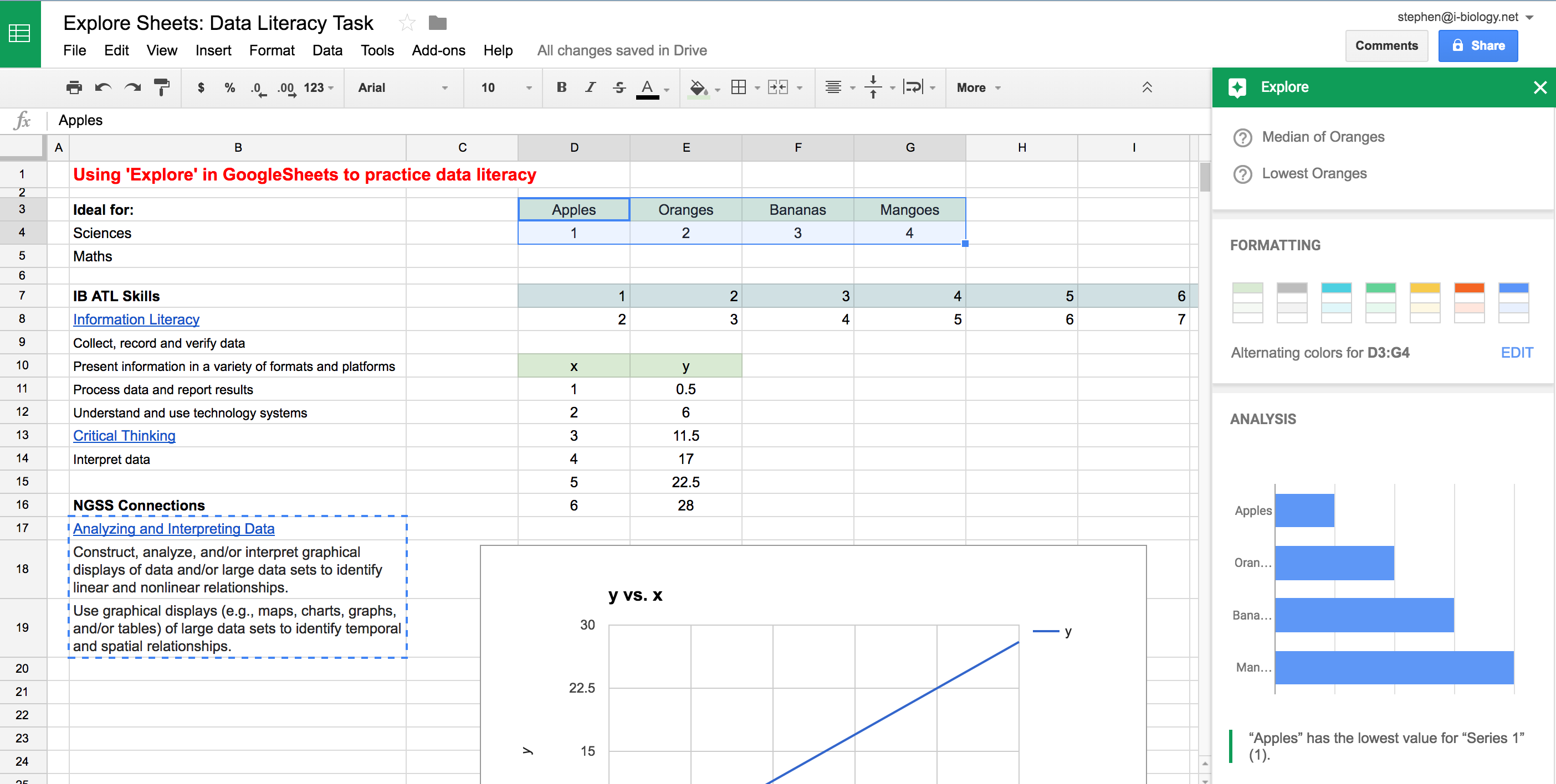 Explore in GoogleSheets – a quick way to visualize some of the data collected in an experiment or survey, and an opportunity to teach some data literacy and critical thinking skills. Click to open.
Going Further: Here is a set of resources for more advanced data presentation and statistics, used for IBBio, but useful for more: IBBio Statbook by Stephen Taylor. This one is for MYP Chemistry.
………o0O0o……….
MYP ATL Skills
| Information Literacy |
| Collect, record and verify data |
| Present information in a variety of formats and platforms |
| Process data and report results |
| Understand and use technology systems |
| Critical Thinking |
| Interpret data |
NGSS Connections
| Analyzing and Interpreting Data |
| Construct, analyze, and/or interpret graphical displays of data and/or large data sets to identify linear and nonlinear relationships. |
| Use graphical displays (e.g., maps, charts, graphs, and/or tables) of large data sets to identify temporal and spatial relationships. |
Excel Graphing Screencasts
These two videos are for my classes, made using the free screencast tool ScreenCast-O-Matic.
The first is for my IB Bio group for setting up a graph for a complex set of data, adding extra datasets, error bars and formatting. The second is a similar video for a simple Physics investigation in Grade 10.
Hopefully they are helpful as you can go back and re-watch important bits as you do the write-ups.
If anyone knows of a decent way to add best-fit curves (lines are easy) to datasets, please let me know!