Category Archives: #edtech #scitech

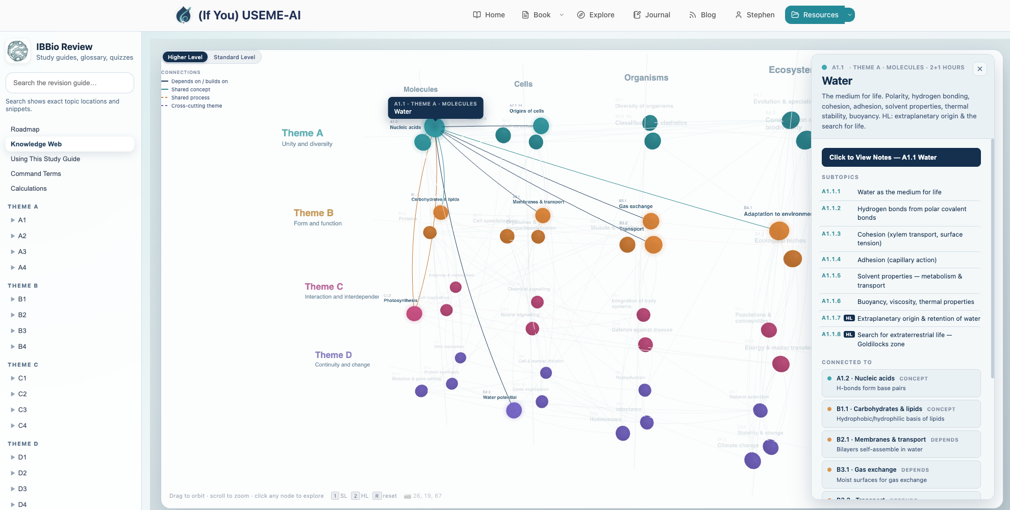
IB Biology Knowledge Web
New Feature added to the IB Biology Study Guide: an interactive Knowledge Web that shows connections between topics on the syllabus, for HL and SL.
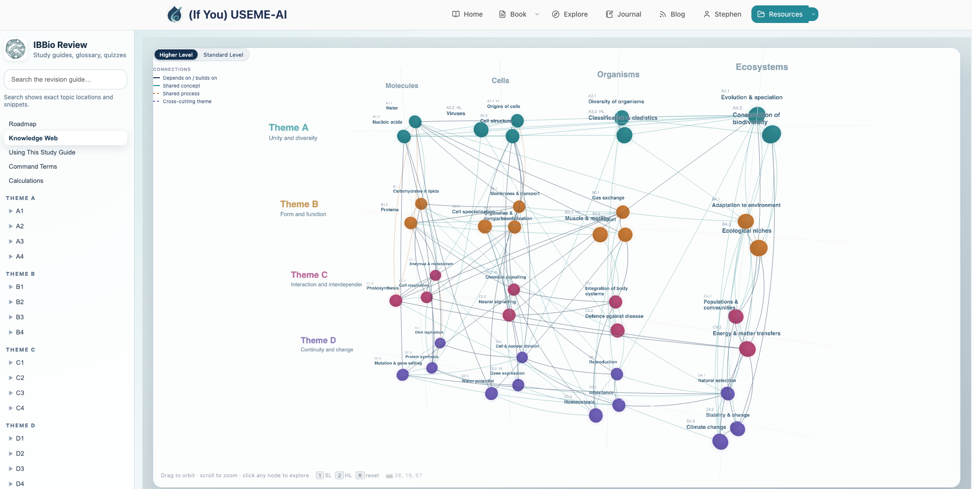
If you click on a node, it shows how it is connected to other topics:
(If You) USEME-AI: The Book
Available from April 1 2026 on Kindle, including Kindle Unlimited subscriptions. Print version is out Now too!
In the space between EdD phases, I’ve been working on a special project… writing my first full book. This has been a real labour of love over the last many months of weekends and evenings, and it’s finally out.
(If You) USEME-AI: Learning for Hope & Agency in an AI World is is a love-letter to education in a time of accelerating change. It builds on 20 years of experience in IB schools, the last 15 years on this blog, ten years of engagement with Cultures of Thinking, four years of work on AI and three years of EdD studies, all pointing in the same direction: a focus on hope, agency and co-creating futures of education that might possibly shine a light on something better. I’ve been writing about this since about 2014 and feel that we need this now more than ever. To do that we need to understand much more than the clicky-click of AI tools.
It frames the reader as a pragmatic idealist, someone who holds onto their values and vision whilst recognising the pressing challenges of now, approaching them with a level head and focus on workable solutions. Across 12 chapters it works through the elements of (If You) USEME-AI, with SideQuests on Mitigation, Adaptation & Innovation, Assessment & Feedback and the TEMPERed Learner along the way. Explore the chapters here.
As we go through the book, it connects learning theories and approaches, aiming to ensure strong foundations so that we can engage with AI with intentionality, purpose and a strong focus on protecting powerful thinking, learning, ethics and the capacities that make us uniquely human in an increasingly automated world. It challenges us to think deeply about what is important, connect new ideas and hold onto a vision of learning that is optimistic, informed and grounded. It makes many connections to UNESCO & OECD guidance and competencies. It aims to balance caution and ethical approaches with suitable applications of AI that might inspire students to do something special and help teachers develop their own practices.
Throughout the book, we spend a year at “Wayfinder International School“, with vignettes from fictional characters Ziggy, Izzy, Ozzy & Jazz, teachers and students approaching the challenges of AI from different perspectives. Meet them here.
Each chapter across the (approximately) 350 pages goes from the balcony of big ideas to the dancefloor of practical strategies, calling at the DJ booth of research. I’ve written it to be as conversational and approachable as possible, whilst connecting it to current research. There are hundreds of references across the book; pretty much everything useful I’ve read in recent years. Each chapter includes a lot of reflective questions, “try this” moments, and prompts to help model your learning as you go.
There is also an extensive, open-access support site for the book. This includes materials for each chapter, a reflective journal (hosted locally), buckets of resources, downloads and a large library of Poes and Prompts to try. The Environmental Impacts Estimator lives here too, with lessons, research and workshop materials. A few more surprises and resources are scattered across the site. The site will be updated as new research emerges or ideas pop into my head. The blog page curates posts from here related to the topics of the book.

The book cover is human-created, by my daughter Anya. It has a swirl of Ginkgo leaves over circuitry, representing connections between the enduring past (Gingko is a ‘living fossil’), the natural world and technology-mediated futures.
My fingers are aching, my brain is mush and my heart is full (I think). It exists! I hope you like it even just a fraction of how much I’ve enjoyed creating it. I think I’ve left everything on the page.
Huge thanks to my friends, family, colleagues and researchers who have inspired and supported this work.
The book will be published first on Amazon Kindle. Links here. It’s available to buy for GBP 8.99 or equivalent. That’s less than the coffee and tiramisu I ordered while writing this post. If you have Kindle Unlimited, it will be free on there for 90 days. The print version will be available very soon.
BioRender: Fabulous Science Image Editor
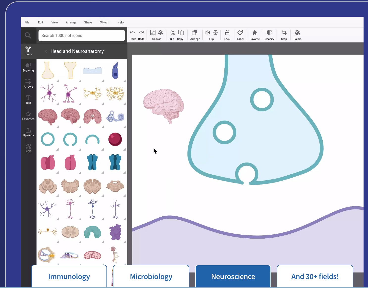 Biorender.com is an incredible FREE tool for students and teachers. With a large library of icons and process diagrams, it is a quick, clean and attractive way to build infographics, diagrams and figures.
It has a huge selection of backgrounds and templates, form cells and processes to organisms and biotech. Templates include science journal, poster and more.
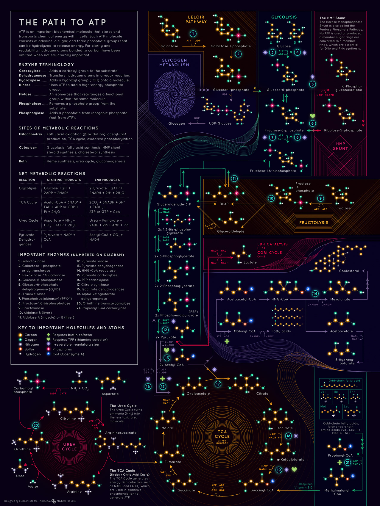
The Path to ATP
Back in 2014, Eleanor Lutz created “How To Build A Human” which has been shared a lot recently – so I went back to her blog to see what is there and wow!
Here is a new (and helpful) infographic for HL Bio, “The Path to ATP”. Think a simpler version of Gerhad Michel’s famous Roche Biochemical Pathways.
Wayfinders: Curriculum as a Compass
If you love knowing stuff, learning stuff, inquiry, imagery and Moana as much as I do, then you might like the latest post on my ideas blog: “Curriculum as a Compass?“.

The apprentice becomes a wayfinder in her own right. [gif source]
Go for the big ideas, stay for the Moana gifs.
Pomodoro Organizer: Get Stuff Done
The Pomodoro Technique is an effective way to overcome procrastination, get started on big tasks (by breaking them into smaller tasks) and to use time effectively. Essentially, by “hacking” your brain’s reward pathway with manageable chunks of time and small reward breaks, it can help overcome the fear of getting going.
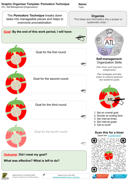 This graphic organizer (pdf) is to help set a plan for a working period, recognizing that:
- Setting clear and realistic goal is essential
- Breaking large tasks into smaller steps helps get things done
- Rewards/short breaks keep the brain motivated
- Setting an overall end time is also really important
- A distraction-free environment will really help
Of course if, once you get going, you find “flow” and can’t stop working… then get it done!
For more ATL-related graphic organisers, click here.
Tech Tools:
- The Chrome extension Pomodoro Timer Pro allows you to set times and “blacklist” sites that might be distractions.
- Online Stopwatch has a good full-screen tomato timer. Scan the QR code below to start the timer running.
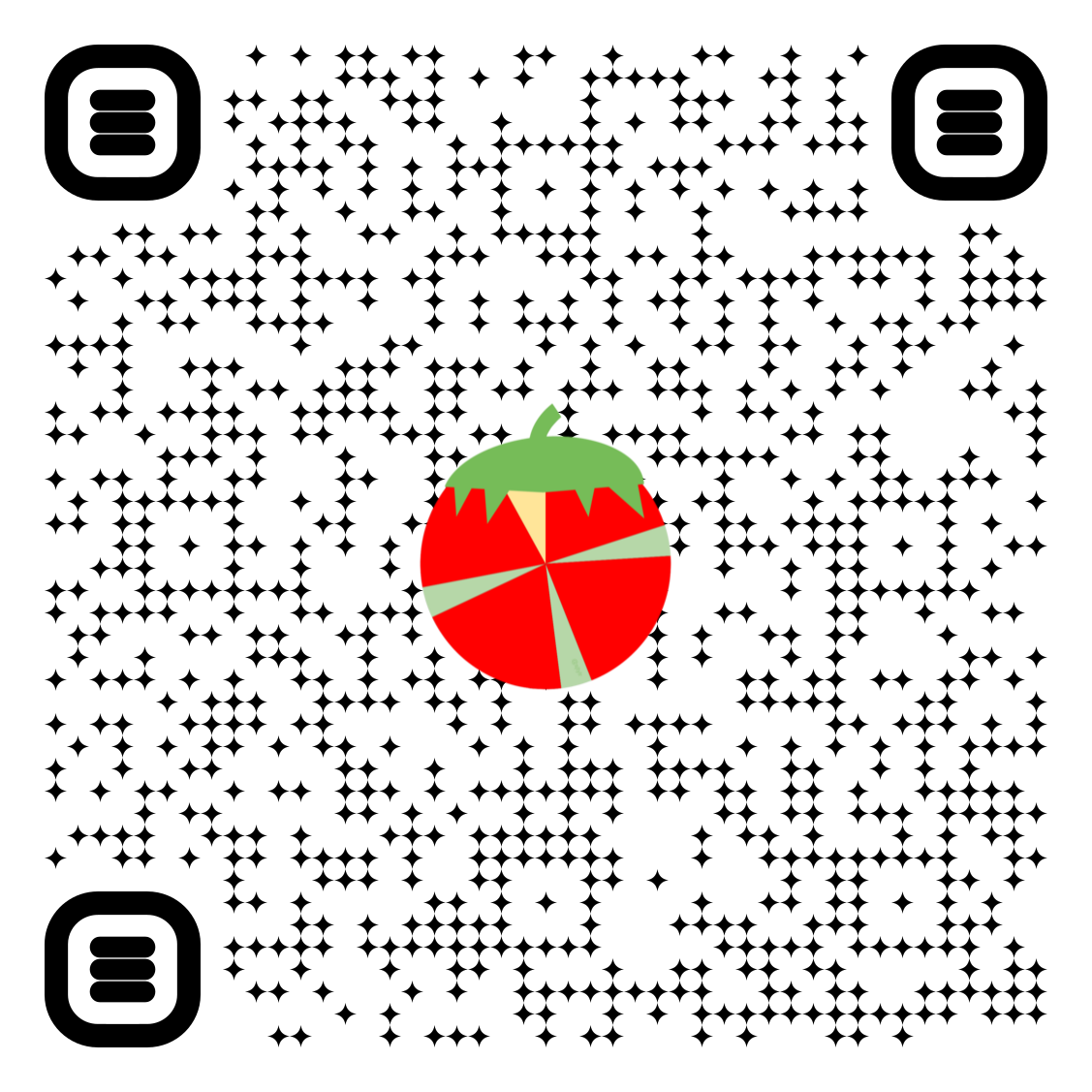
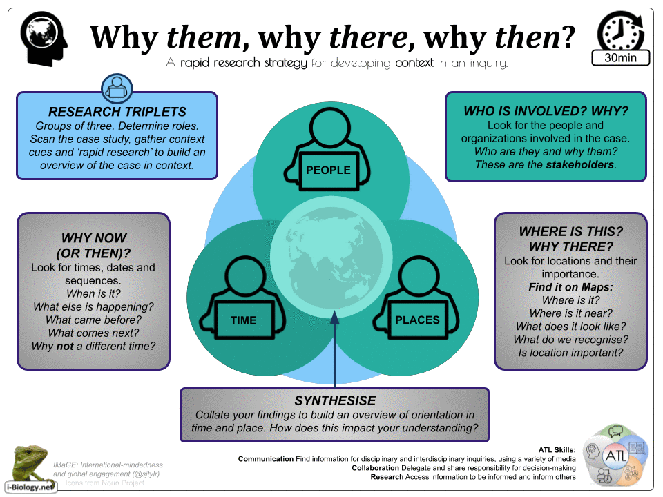
IMaGE Inquiry: Why Them, Why There, Why Then?
Here’s a visual organizer for building quick context in orientation in time and space in a case study or unit of inquiry. It is not only for sciences – it could easily be applied to other subjects with the intention of contributing to a sense of international mindedness and global engagement (IMaGE). The simple goal is for triplets of students to complete collaborative rapid research around the case: Why Them, Why There, Why Then? Click for pdf. This has been tested in rough drafts, and I’d love for some others to try it out and give feedback.
Some examples:
- Recent (or significant) discoveries or events (in the news, science, etc)
- The Human Genome Project: Who was involved and why them? Where did it happen and why there? Why then and not before?
- Antoni van Leeuwenhoek discovering animalcules. Why him? Where there? Why then? Why not other people, places or times
- LangLit: Explore the author, location and time
- I used it for a cover lesson on Dr. King’s “I Have A Dream” speech, with a group of students who had almost no prior knowledge.
- I&S: Considering a significant development, event or innovation
- Service Learning Cycle: An entry point into the “Research” phase of the cycle and determining reasons, needs and causes (thanks @AlisonKIS).
This is not a tool for in-depth research (though it could be expanded outwards). It is intended to get a quick, reliable orientation in time and space around a case study and the people or organisations involved.
Some great tools for this include Google Maps, Google Cultural Institute, Google Images, Wikipedia, Biography.com, On This Day (History.com), Charity Navigator and many more.
 Also Wolfram|Alpha: People & History, Places & Geography, Socioeconomics, compare countries, compare companies and much more. See Stephen’s page on databases & Wolfram|Alpha here.
The results can be synthesised into further lines of inquiry (to use more rigorous research), but this should give students a vision of the case. What cultural or contextual cues can they recognise? How might this activate further connection and questioning?
Webb’s DOK4 as a Filter for “Transfer”
As any teacher knows, “transfer” is notoriously difficult to truly teach, yet it is a part of the IB’s ATL skills framework as it is really important in empowering self-directed learning. Here’s a post on Webb’s DOK4 and how it might be used as a tool for teaching transfer of knowledge, skills and concepts. Also, DOK is a not wheel.
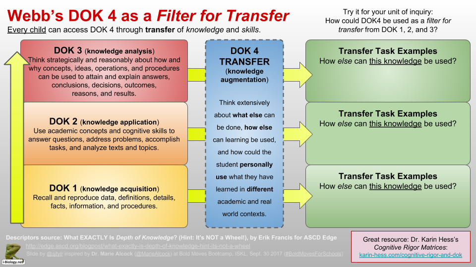
DOK Filter: DOK4 can be accessed from any other level, using the question “how ELSE can this be used?”. Tools for DOK4 Transfer might include #EdTech, inquiry, challenges, experiential learning, service learning and much more. Diagram by @sjtylr.
Reflecting on the Impacts of Science: IMaGE, Global Goals & Connections in MYP Sciences.
I’ve added a new page to i-Biology.net to post resources and ideas for MYP Science Crit. D: Reflecting on the Impacts of Science. Some slides are below, but to see the full page, click here.
[IMaGE = International Mindedness and Global Engagment. To see my dissertation & resources on this, click here.]
“Levels of Why?” Graphic Organizer
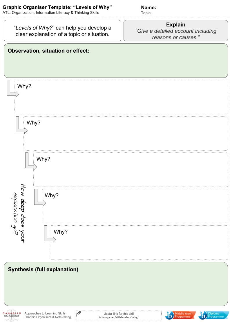
Levels of Why – click to download a pdf
This is a graphic organiser developed to help students move from outline or describe into explain.
- Begin with stating the situation, change or process.
- What is the surface explanation or reason?
- Why does that occur?
- What about that?
And so on…