Data Literacy with ‘Explore’ in GoogleSheets
Super-quick lesson idea for teaching datasets and presentation types. When processing data in Google Sheets, use the ‘Explore’ feature, highlighting parts of the dataset. Click here for an example (to save a copy, go to ‘file –> make a copy’).
For: Sciences, Maths
Thanks to Liz Durkin (@lizdk) for the reminder of this feature.
Questions to ask students
- What are different types of data (continuous, discontinuous)
- Why do we use graphical presentations of data?
- What information do we need to be able to present data clearly?
- Why are some data presentations suitable for some sets of data and not others?
- How are the ‘basic’ presentations of data limited? (or Why can’t I use a bar chart for everything?).
- How does my interpretation of the data change when I change the graph or chart type?
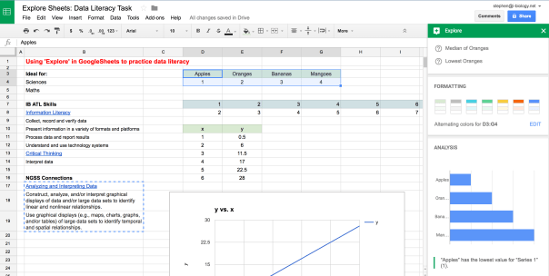 Explore in GoogleSheets – a quick way to visualize some of the data collected in an experiment or survey, and an opportunity to teach some data literacy and critical thinking skills. Click to open.
Going Further: Here is a set of resources for more advanced data presentation and statistics, used for IBBio, but useful for more: IBBio Statbook by Stephen Taylor. This one is for MYP Chemistry.
………o0O0o……….
MYP ATL Skills
| Information Literacy |
| Collect, record and verify data |
| Present information in a variety of formats and platforms |
| Process data and report results |
| Understand and use technology systems |
| Critical Thinking |
| Interpret data |
NGSS Connections
| Analyzing and Interpreting Data |
| Construct, analyze, and/or interpret graphical displays of data and/or large data sets to identify linear and nonlinear relationships. |
| Use graphical displays (e.g., maps, charts, graphs, and/or tables) of large data sets to identify temporal and spatial relationships. |
Posted on January 23, 2017, in #edtech #scitech, Approaches to Learning, Spreadsheets and Graphing, Uncategorized. Bookmark the permalink. Leave a comment.


Leave a comment
Comments 0