Category Archives: Areas of Interaction
Pomodoro Organizer: Get Stuff Done
The Pomodoro Technique is an effective way to overcome procrastination, get started on big tasks (by breaking them into smaller tasks) and to use time effectively. Essentially, by “hacking” your brain’s reward pathway with manageable chunks of time and small reward breaks, it can help overcome the fear of getting going.
 This graphic organizer (pdf) is to help set a plan for a working period, recognizing that:
- Setting clear and realistic goal is essential
- Breaking large tasks into smaller steps helps get things done
- Rewards/short breaks keep the brain motivated
- Setting an overall end time is also really important
- A distraction-free environment will really help
Of course if, once you get going, you find “flow” and can’t stop working… then get it done!
For more ATL-related graphic organisers, click here.
Tech Tools:
- The Chrome extension Pomodoro Timer Pro allows you to set times and “blacklist” sites that might be distractions.
- Online Stopwatch has a good full-screen tomato timer. Scan the QR code below to start the timer running.
“Levels of Why?” Graphic Organizer
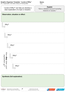
Levels of Why – click to download a pdf
This is a graphic organiser developed to help students move from outline or describe into explain.
- Begin with stating the situation, change or process.
- What is the surface explanation or reason?
- Why does that occur?
- What about that?
And so on…
Data Literacy with ‘Explore’ in GoogleSheets
Super-quick lesson idea for teaching datasets and presentation types. When processing data in Google Sheets, use the ‘Explore’ feature, highlighting parts of the dataset. Click here for an example (to save a copy, go to ‘file –> make a copy’).
For: Sciences, Maths
Thanks to Liz Durkin (@lizdk) for the reminder of this feature.
Questions to ask students
- What are different types of data (continuous, discontinuous)
- Why do we use graphical presentations of data?
- What information do we need to be able to present data clearly?
- Why are some data presentations suitable for some sets of data and not others?
- How are the ‘basic’ presentations of data limited? (or Why can’t I use a bar chart for everything?).
- How does my interpretation of the data change when I change the graph or chart type?
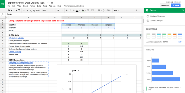 Explore in GoogleSheets – a quick way to visualize some of the data collected in an experiment or survey, and an opportunity to teach some data literacy and critical thinking skills. Click to open.
Going Further: Here is a set of resources for more advanced data presentation and statistics, used for IBBio, but useful for more: IBBio Statbook by Stephen Taylor. This one is for MYP Chemistry.
………o0O0o……….
MYP ATL Skills
| Information Literacy |
| Collect, record and verify data |
| Present information in a variety of formats and platforms |
| Process data and report results |
| Understand and use technology systems |
| Critical Thinking |
| Interpret data |
NGSS Connections
| Analyzing and Interpreting Data |
| Construct, analyze, and/or interpret graphical displays of data and/or large data sets to identify linear and nonlinear relationships. |
| Use graphical displays (e.g., maps, charts, graphs, and/or tables) of large data sets to identify temporal and spatial relationships. |
GoogleEarth Engine Timelapse: Quick Lesson Plan
Here’s a quick lesson plan idea for tuning into inquiry using Google Earth Engine Timelapse*. It can provide a timelapse of change from 1984-present, based on satellite and aerial photos.
Context
Ideal for: Individuals & Societies, Sciences, Interdisciplinary Unit
Global Context(s): Fairness & Development or Globalization & Sustainability
Key Concept(s): Change, Development, Interactions, Time-Place-Space
Related Concepts (I&S): Globalization, growth, resources, sustainability, causality
Related Concepts (Sciences): Environment, transformation, consequence, evidence
Tuning In
Find where we live and model See-Think-Wonder (Project Zero) on the timelapse from 1984-now. You might want to create a GoogleSheet with columns for each stage, to be shared with the class. Alternatively, get out some big whiteboards or butcher paper.
- See: look for general outlines, specific landmarks, big developments, interesting changes. Then dig deeper – compare the start to the end, or look for evidence of significant events in the time period. Keep pushing the ‘see’ until ideas are truly exhausted.
- Think: connected to the ‘see’ statements, note potential cause-effect relationships, sequences, consequences or other ideas. Keep going until this is exhausted.
- Wonder: finally build on the ‘see’ and ‘think’. What questions does this generate? Categorize and rank the questions.
Finding Out
- What lines of inquiry will you take to find out more?
- What can be found out by students and what needs to be explicitly taught?
- What unit-related vocabulary needs to be used and taught?
Approaches to Learning
- Access information to be informed and inform others
- Make connections between various sources of information
- Understand and use technology systems
- Practise observing carefully in order to recognize problems
- Interpret data
- Draw reasonable conclusions and generalizations
- Revise understanding based on new information and evidence
- Formulate factual, topical, conceptual and debatable questions
- Use models and simulations to explore complex systems and issues
- Identify trends and forecast possibilities
……….o0O0o……….
*HT Twitter:
Making the Invisible Visible: Climate Change & CO2
This is very neat video from NASA, showing carbon dioxide changes over time, with annotations. See a breakdown here.
Exploring Environments: Science Writers
Building on last year’s Exploring Environments units (G10 Environmental Science), in which students formed groups and designed their own units of inquiry, we have once again taken on the science-writing challenge.
Brief: write a 1,200-1,500 word article for an online audience highlighting a case study connected to your unit’s central ideas. The articles should be aimed at peers and smarter, and should include properly-used media and video where appropriate.
Assessment: One World and Communication in Science
Process: Topics proposed and drafted through GoogleDocs, with students seeking feedback on writing through highlighting and comments in the GoogleDocs. In the final sessions they put the articles together in WordPress and gave peer-feedback for quality of presentation, flow and message. We aimed to use images found through CreativeCommons Search and through Getty’s free Images (though the embed widget went squiffy on some of their wordpress editors).
Teacher note: this kind of task is a great way to realise that we are all language teachers. Managing workflow through GoogleDocs/Hapara makes commenting on drafts easier, though students need to keep their work there in order to show progression.
……….o0O0o……….
Some highlights (with a range of scores) are posted below. Please click-through, read them and leave some encouraging comments!
- Bottom-trawling: destroying centuries of growth, by Polina
- Nozomi asks “Should we eat bugs?“
- “The ocean is turning to blue vinegar,” according to Jay
- Saumil explores George Monbiot’s articles on “how wolves change rivers” and how rewilding might help us return nature to some semblance of its former glory.
- Nyeong-Min asks us to “protect our UV protector“
- Seung-Cheol tells a bee story, exploring colony collapse disorder
- Luke coughs his way through the Beijing air pollution and places our demand for cheap goods at the root
- Lucas gives an explainer of PM2.5 pollution and thinks about what we can do about it.
- Andy gets concerned about the effect of CO2 on our beach time
- Koh asks if fish farming is a viable alternative to overfishing
Exploring Environments: Student-Designed Units & Hapara
Click here for a summary of our recent student-designed Grade 10 (MYP5) Environmental Sciences unit that we planned for students to design and implement. I used this project as my trial for Hapara, a GoogleDocs dashboard system.

Hapara Dashboard: screenshot well after the project has finished, but you get the idea. Green = Bio, Orange = Chem. Click on the image for the post about the project, including some sample documents.
In summary, using this as a management tool allowed for a smooth and highly differentiated, student-led inquiry unit in MYP 5 Environmental Science. Find out more.
Student Science Writers: Environmental Issues
As we finish our Exploring Environments student-designed units, students have published blog posts for the science communication assessed task. In this task, assessed for Communication in Science, they had to pick a case study or current news item of interest and direct connection to their group’s unit. Using guidance, models of good science writing, GoogleDocs drafting (and for some, pointers from professional science writer Andy Revkin), they wrote short articles on their case study.
There’s no point writing for an audience of one, so…
..here they are!
If you do visit and feel like posting a comment, remember that these are school students, and that your comments must be appropriate, constructive and positive.
- Maggie’s post on fighting Aricanized bees with… more bees!
- Heather’s post on invasive mussels and their damaging impacts.
- Parina’s post on 13 oils spills in 30 days (!)
- Joanna’s post on Australia burning.
- Kyoko’s post on painting the roof white to cool the town.
- Rohan’s post on the cost of shark finning.
- Sanam’s post on the end of the reign of the king of butterflies.
- Stephanie’s post on cell phones and honeybees.
- Mahya’s post on Australia’s new colour on the temperature chart.
- TaeHyun’s post on spring floods and the Gulf of Mexico dead zone.
- Yota’s post on Sea Shepherd vs Japan.
- Aili’s post on bluefin tuna being worth too much dead to be allowed to live.
- Cedric’s post on the mystery of the dead pigs in China.
- Mikka’s post on the shrinking Antarctic ozone hole.
- Haruki’s post on the highest global temperatures in 4,000 years.
“Changing Crops for a Changing Climate” Mark Lynas & a Nature Special on GMOs
Here is Mark Lynas at Cornell University, with his speech “Time to call out the anti-GMO conspiracy theory.” It runs almost half an hour, though he does have a transcript of the speech on his blog. The connections to IB Biology Genetics & Genetic Engineering here are obvious.
What should be noted for background is Lynas’ own story. In the 1990’s he was a prominent anti-GMO activist, but has recently apologised and is now on a mission to right the wrongs he feels he has done. It has not been easy, and has generated lots of controversy.
“Allowing anti-GMO activists to dictate policymaking on biotechnology is like putting homeopaths in charge of the health service, or asking anti-vaccine campaigners to take the lead in eradicating polio.”
Powerful and provocative stuff – and a great stimulus for discussion and debate. Lynas refers to a lot of studies, claims and organisations in this speech. Students could follow this up with finding out more about each of them.
We might never be able to get students to the absolute truth on GMOs – we may find it difficult ourselves – but it is useful to give some insight into just how delicate the balancing act can be and how cloudy the discussions of ethics in science can get. The issues around GMOs are complex: scientific, political, ethical, economical, environmental. They are far more complex than a couple of short assessment statements in a Biology syllabus can really do justice.
……….o0O0o………

Rise of the Superweeds. Click-through to the Nature Special.
Also recently, a very useful Nature special edition on GM Crops: the Promise & Reality. Look in for some in-depth articles and case-studies, including the true, the false and the still unknown on GM crops.
Nature articles often have presentations of data that can be used for data-based question practice (such as the one to the right – click through to see). Follow the patterns of the DBQ’s and make up your own questions based on different articles:
- Identify…
- Describe the trend in…
- Calculate the difference in…
- Compare…
- Suggest reasons for…
- Evaluate…