Science Video Resources Facebook Page!
 We have a Facebook page!
Thanks to a really helpful tutorial from FreeTech4Teachers, I was able to create a Facebook page for this blog, so you can ‘like’ it and follow the posts in your feeds. I know you check fb way more than you check your school emails or this blog, as I always see the ‘Facebook shuffle’ as you open the conveniently-placed work-looking window when teachers walk by.
Will this be a useful tool? Let me know!
Creative Commons & Reasonable Use
Find out more about about Creative Commons in education… Read the rest of this entry
Statistical Analysis and Internal Assessments
Welcome back BIS students!
Now that we’re well settled back into school, here are some updates for Statistical Analysis and your IA’s.
More resources have been added to the Statistical Analysis page, and the presentation has been updated to replace bar charts with simple plots of the mean:
If you look in the menu bar above, you’ll find more pages added over the summer break. I need to get a life. Included are some pages under development for IA help (including Design, DCP and CE), and the IA rubric checklist has been updated with some of the checkboxes edited.
Also, we now have Turnitin working on Moodle – Rock on! All of your work will now be submitted and graded online, so keep checking there for due dates.You no longer need to log in to Turnitin, so go ahead and forget that password – Moodle will do all the hard work for us. Actually, no it won’t. You will do all the hard work, but Moodle will make it easier for us to ensure academic honesty and for you to submit drafting stages.
All classes check the MrT’s Classes tab above for the most up-to-date handbooks and assessment outlines. There is also a new page to help the class of 2011 write their TOK essay using Biology.
You will also find new assessment criteria and formats for Essential Biology as we go along, with an emphasis on command terms, citing your sources and researching beyond the presentations and green book. Your handbooks/ folders now have yellow pages for in-class note-taking and lab work, using the Cornell style, so let’s give that a whirl.
Speaking of Command Terms:
Finally, there is a new opportunity for extra credit: Bio Book Club. Sound like fun? Then get reading!
Information Is Beautiful at TEDGlobal 2010
Linked to some of the other posts about data visualisations, here is Information is Beautiful creator David McCandless at TED Global 2010.
“Data is the new (s)oil”
Visualisation is a great tool for highlighting trends and patterns in data sets, but we must still learn to go into the data ourselves. We must use a critical eye when looking at these graphics – what do they intend to communicate and how well do they achieve their goal?
Happy Independence Day Indonesia!
Indonesia celebrates its 65th year of independence today, so it’s a good time to point out a section of this site dedicated to where we live!

Homo floresiensis
Aside from its colourful history, Indonesia is a science hotspot, rich in marine and rainforest biodiversity, geological resources and events, pioneering conservation efforts, fossils and really awesome people. It has been of interest to the outside world since (probably before) the days of the spice islands, and around 150 years ago, Alfred Russell Wallace was out here studying the amazing diversity of life here.
Wallace’s famous work, The Malay Archipelago, was dedicated to Charles Darwin. Wallace also hit upon ideas of natural selection and descent with modification while travelling around these islands, parts of which were to become Indonesia.

The Wallace Line
Wallace noted that although neighbouring islands shared many characteristics and species, there was a marked division between those of Bali and the west and those of Lombok and the east, even though the divide between Bali and Lombok was small. This division was to become known as the Wallace Line: western islands are characteristic of south-east Asia, whereas eastern islands are biogeographically more closely related to Australasia. With two distinct geological origins, species had separate genetic lines and paths of evolution. Through natural selection, Wallace wrote that barriers to interbreeding would evolve, leading to reproductive isolation and speciation – the Wallace Effect.
That’s cool, and that’s where we live.
—————————————————————————————–
You can read the whole book online, via Google: The Malay Archipelago.
Here is a clip of Sir David Attenborough reading from Wallace’s book as he follows in his footsteps for a BBC documentary:
And here is giving a full lecture on Wallace at Bristol University:
—————————————————————————————–
If you’re a Bio undergrad or graduate and have time and money to spare, you could do a lot worse than checking out Operation Wallacea, where you can boldly go where Wallace went before and take part in biodiversity and conservation research.

Journalism Warning Stickers

Click to visit Tom Scott's blog
When you leave Biology class, or go on to study more at university, I really hope that you have a greater appreciation for how to access and evaluate scientific information. We know that sources can be biased, poorly produced or simply misleading or factually incorrect. The trick is learning how to recognise these. Wouldn’t it be great if there were warning labels, like those on our chemical bottles, that flagged up issues with journalistic articles?
Well Tom Scott thought just that, and here are the fruits of his labour, on his funny blog Making Stuff Happen.
Unfortunately, this does not really exist, so we’re going to have to learn the old-fashioned way. Read, read, read. Use many sources, look at the data and if in doubt, bring it to class and we’ll have a look together.
Holiday Post:The Science of Big Waves
I’m off on holiday for a few weeks, so here is a cool video to keep you busy: The Science of Big Wave Surfing, about Mavericks. Maybe if I’m lucky I’ll get to paddle into some little Bali beach waves this week!
This video comes from the YouTube channel of KQEDOnDemand, which is a public media service for northern California (kind of like PBS). Anyway, they have a good Science channel, as well as Education and other topics, so have a look.
BIS Students: don’t forget your holiday task here. Due on the first day back.
See you in August!
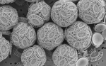
Can you guess what this is?
Click on the image to zoom in. What can you see?
 The answer is after the jump.
Snake Oil? Cool infographic on health supplements
One of my favourite blogs is Information Is Beautiful, and here is a lovely example of how a large dataset can be turned into something visual and easily interpreted: The Scientific Evidence for Popular Health Supplements.
 What does it represent?
– size of bubbles represents Google search popularity
– height of bubbles represents strength of scientific evidence for its efficacy in the specific health use
By making use of the Cochrane.org systematic reviews of double-blind clinical studies, IIB have made sure that we are looking only at reliable, scientifically sound data. You can even see the data here.
I am looking forward to seeing David McCandless’ TED Talk in the upcoming TED Global 2010 at Oxford. Of course, I’ll be watching on the web. Check out more of their infographics here.
Neither Science nor a video but…
… I found this funny. From XKCD.com. What is the difference between a simile, a metaphor and an analogy?

Analogies, from XKCD